Final Assignment, The Demise of Gamers
|
|
|
|
|
|
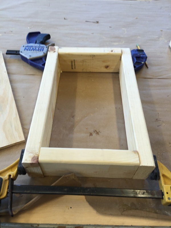
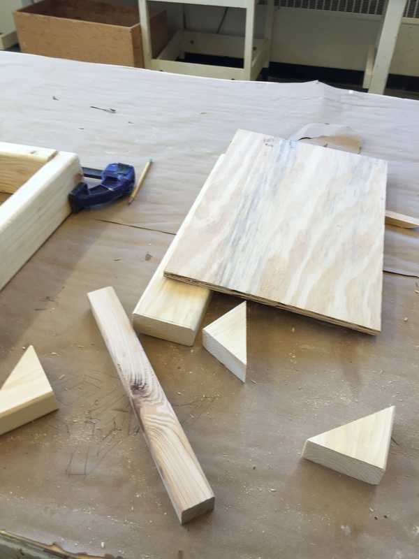
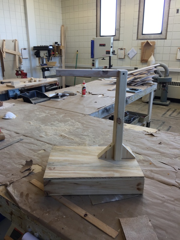
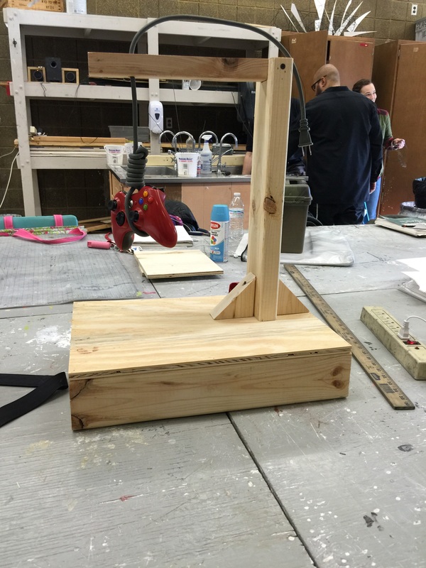
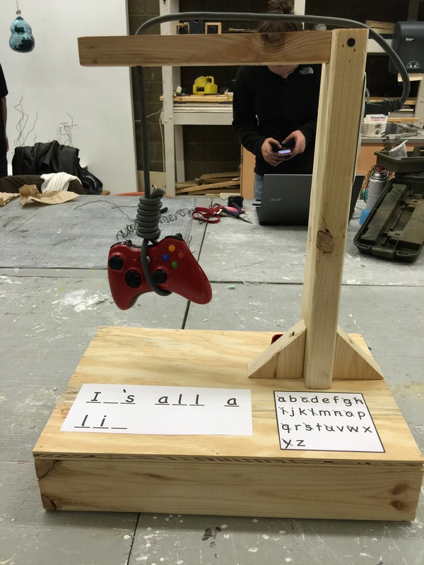
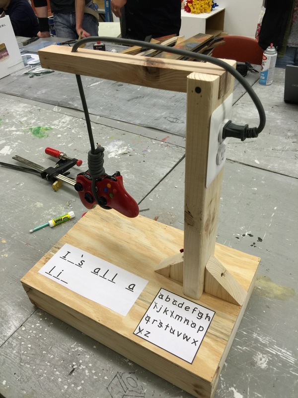
Where to begin, well this is my final project of the year for 3d foundations, and I just have to say that this class has been pretty amazing. There were times I hated what we were doing but overall the experience was great. Now about the project, the prompt I went with was the demise of something, and the fist thing that popped into my mind was the article that numerous gaming journalist put out describing the end of gamers. The thing is, were all still here and don’t intend to go anywhere, we as a community are currently thriving in an industry that makes over 25 billion dollars a year. So why did gaming journalist put out such an article? Well this whole incident goes back to a person named Zoey Quinn, she is a video game programmer who had relations with other journalist to improve the reviews that they would write about her latest game. The story came out and the gaming community was outraged about the corruption in this form of journalism, we all got our unfiltered opinions from these sites, but if its that easy to influence them what else could they have lied about. What came from this was people were saying hateful things to the journalist and Zoey Quinn, and what happened next was Zoey used this opportunity to shield herself with the current feminist movement, stating that all gamers are racist, and perpetuate the stereotypical ideal girl in video games. The journalists who were under attack wrote the end of gamers, talking about how now that gamers were exposed as sexists and racist, that the fad would soon die out. I know that was a little long of an explanation but honestly most people don’t know about it. I hope you see how this is a bit ridiculous, but I do encourage people to look this up and make sure I'm not making it up. Now with my project I went with a sarcastic view on the prompt, and the whole thing is a take on the game hangman. The controller is suspended with a power cord to a game console and then actually plugged in to keep it hanging. I went with wood because of how much fun I had last time using the material, and what better way to make the gallows. When looking at phrase the viewer has to figure out what it’s trying to say there by making the viewer a part of the piece. When figuring it out they themselves become a gamer, and the piece is all a lie. There’s not much else I want to improve on, the feel of the game is there, and the way everything is displayed is great. This has to be my favorite project from this class probably because everything had to be created by me; the idea, what it was made out of, and what the message would be. I am very proud of what I have created, and think it speaks for itself, which is something I’ve always wanted to create.
Put a Bird on it! Assignment 6
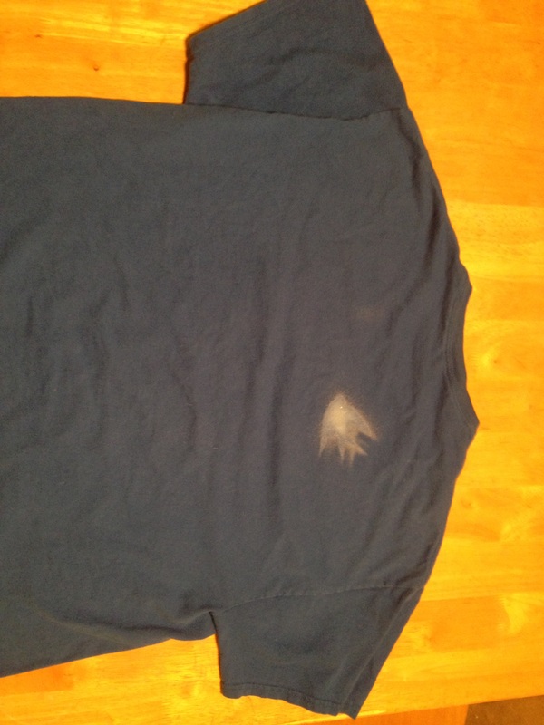
Okay so after seeing the Portlandia put a bird on it video, I was kind of confused as to what exactly we were doing, since every project before it had specific parameters like what we had to use to make the project. Basically what I took away from it was that we needed to do some sort of minimal work, like just slapping a bird on something, and have a conceptual reason for it, where we begin to blur the lines between fine and commercial art. Normally I can come up with a conceptual idea during the processes of making the piece, but this time I wanted to go into the project with the concept. About a year ago I was doing a research project on Spencer Finch where at the end we had to make something that resembled his style of work. The piece I chose to emulate was a painting called clouds, where Finch sat out in a field in New Zealand and painted a straight line that changed colors every time a cloud covered and uncovered the sun. What I took away from all of that was how well can we understand the experience one person had from a byproduct of that experience. So for my piece I decided to make it the byproduct of an experience, last time I did this it the emotions I got were more of a shock from my audience, so this time I wanted to do something humorous or possibly negative. Which is where I came up with the idea to spray paint a bird on my roommate’s shirt, and the shirt becomes the art. Without any description of why that shirt has a bird on it, the shirt become nothing more than a shirt with bird on it, but when the story behind it is said it becomes art. My favorite thing about art is that, art is anything that evokes a reaction from people and that reaction could be anything.
Thinking Outside of the Toolbox, Assignment 5
|
|
|
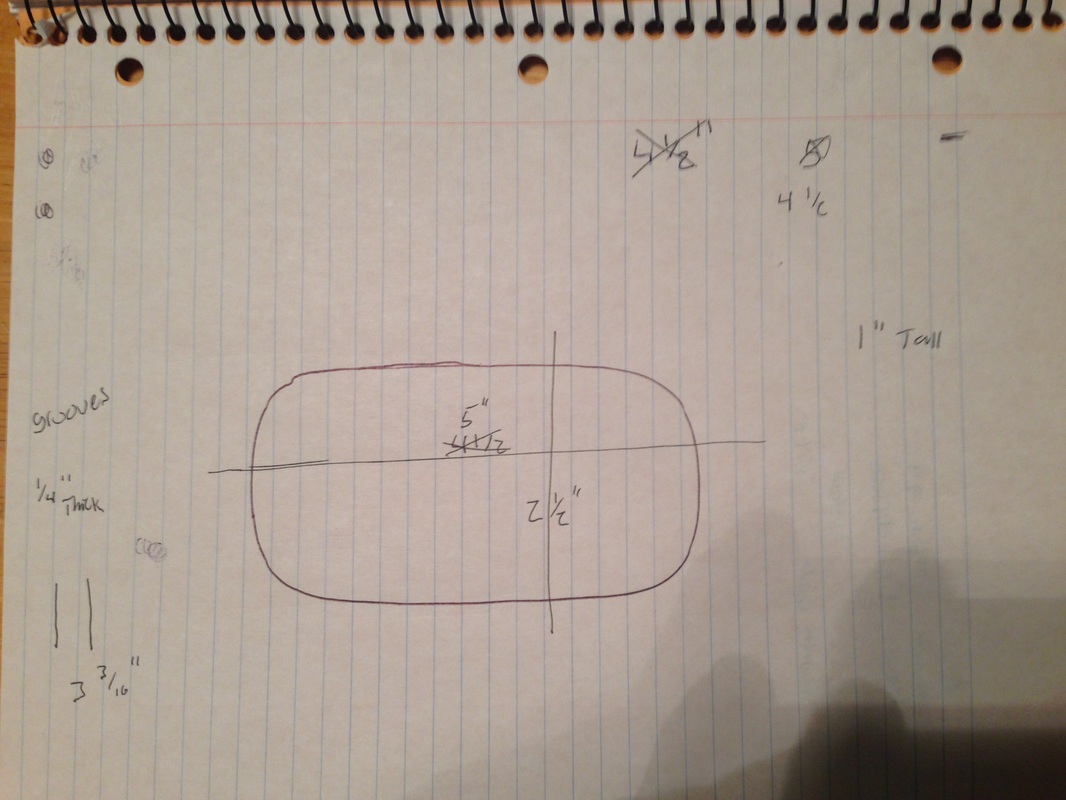
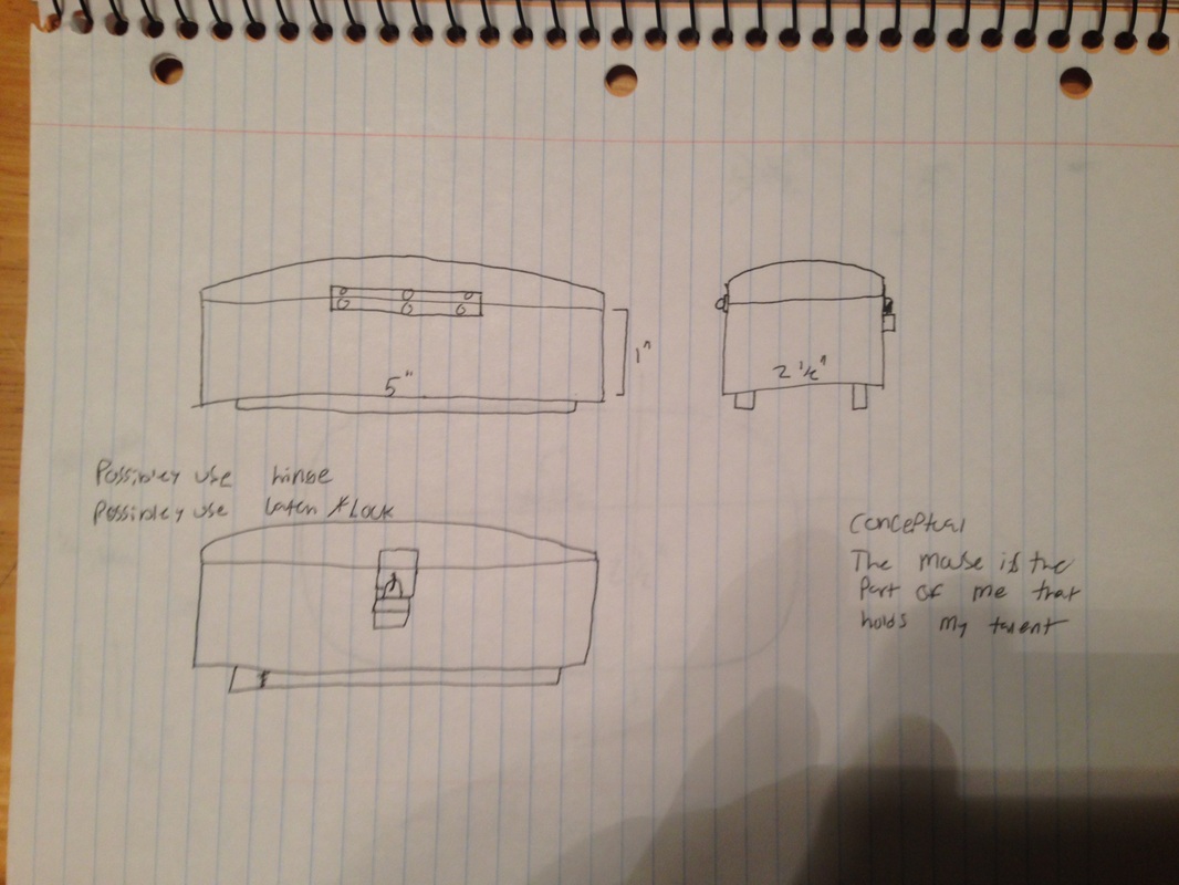
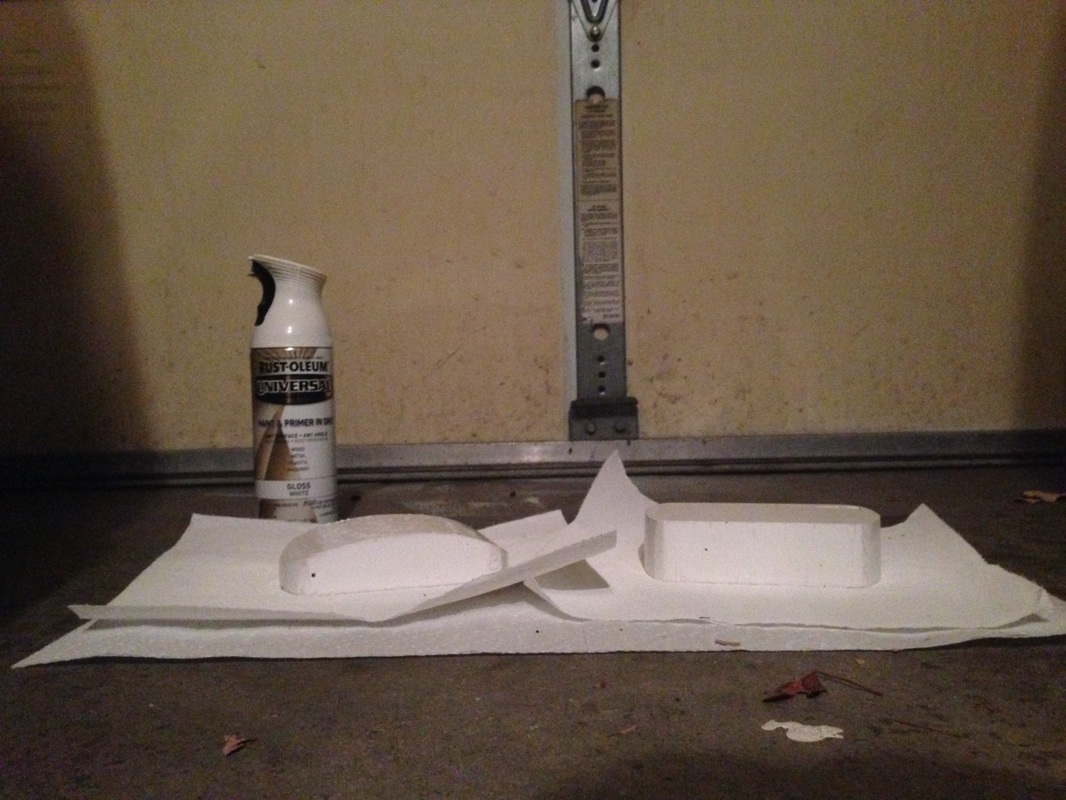
When it comes to wood working I'm not the most qualified person for the job. My past experiences with wood are the pinewood derby race in boy scouts where I told my dad how I wanted the car to look and when he was done with the power tools I got to sand and paint it, other than that I took a woodshop class in middle school where the most dangerous tool I used was a hack saw. So when I first stepped up to the table saw I wasn’t a hundred percent confident I wouldn’t mess up. Aside from how I felt during the project my piece was to be a toolbox for my mouse. My mouse is what makes me who I am, it is the tool of my trade and without it, I cannot create, so I must keep it safe and protected. The mechanics of my toolbox include a hinge and a locking mechanism, so as to keep my mouse safe and protected. I designed the box to resemble my mouse, which is a simple arch and a somewhat oval shape where the long sides are straight. The box is completely white, which as I found out during the painting process is very difficult to keep white, also sanded down wood doesn’t do a very good job of keeping paint on it, especially when its cold out. I do intend on going back and touching up on the paint, but other than that the shape it took and what it stands for means a lot to me and really did turn out how I intended it to. The inside of the box it just big enough for the mouse to fit in and I could almost see myself actually using this for the purpose of storing my mouse. I enjoyed this project, and had fun using power tools for the first time.
Digital Bling, Assignment 4
|
|
|
|
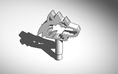
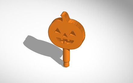
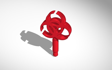
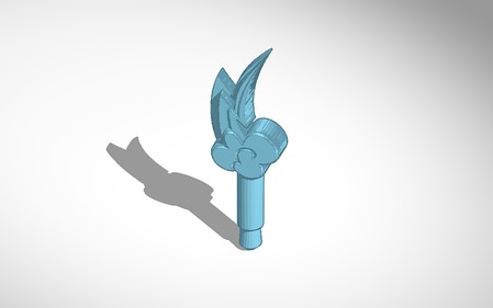
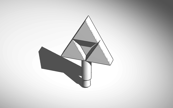
When I was told that we were doing a project that involved a computer I was pretty excited, I'm a visual communications major and computers are my thing. I have never used a computer to make something in 3d, all of the things I make are in 2d, but with being on a computer I felt right at home. I didn’t want to make a ring or some sort of wearable object I wanted to make something that I can use daily. Something I use daily is my phone, and I have seen them before, dust protectors for the headphone jack. Conceptually my design is lacking, but being on a computer I was working more like I would as a graphic designer, for the consumer. Making designs that would appeal to a multitude of people to purchase, starts with making sure that the design is recognizable. So simple things like a pumpkin and biohazard symbol was where I started, to makes sure it appealed to people who like positive and negative things. Then the rest was for me, mostly things that I would actually want like the huskie logo for NIU and the triforce from the legend of Zelda. Given the chance to make something for myself on a 3d printer I wanted to make something I really did enjoy. I can see that making something that that the typical consumer would want could hold some sort of deeper meaning like how easy it is to make something that people want to buy. Originally that was not my idea but one of my favorite things about art is that any sort of message you can take away from the piece is true and could be used to describe it. I really did enjoy this assignment and probably will do more even though its not been assigned to me. If I could this is how I would do every 3d design, all the time.
Downloads
|
|
|
|
| ||||||||||
Public Art, Assignment 3
|
|
|
|
How it Would Look in the Real World
|
|
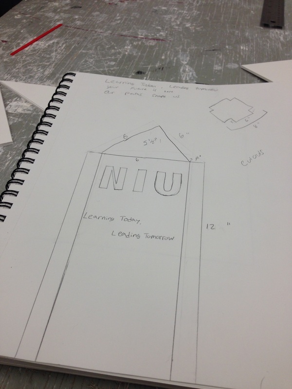
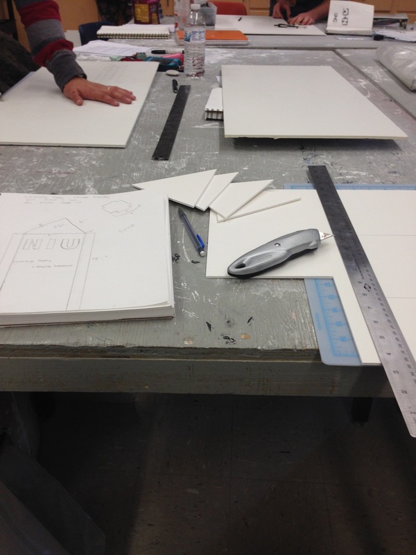
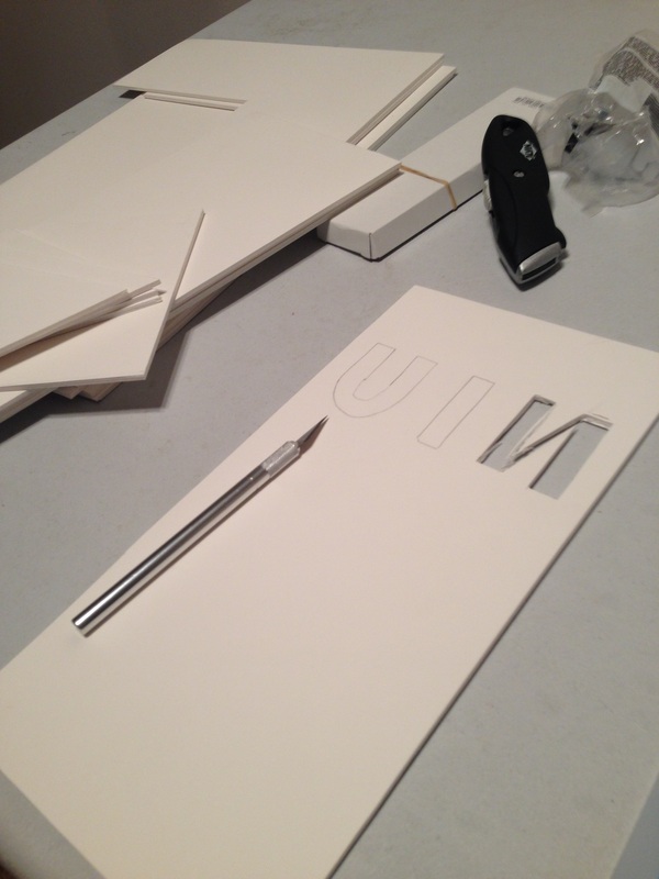
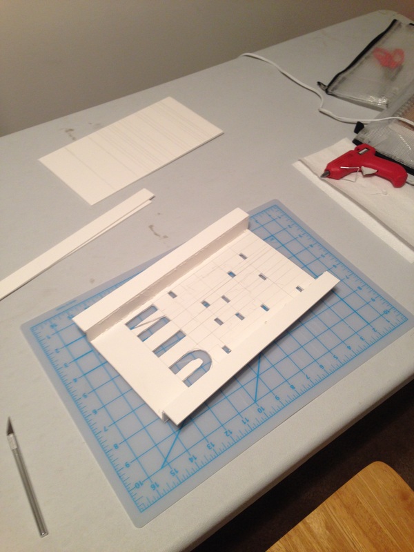
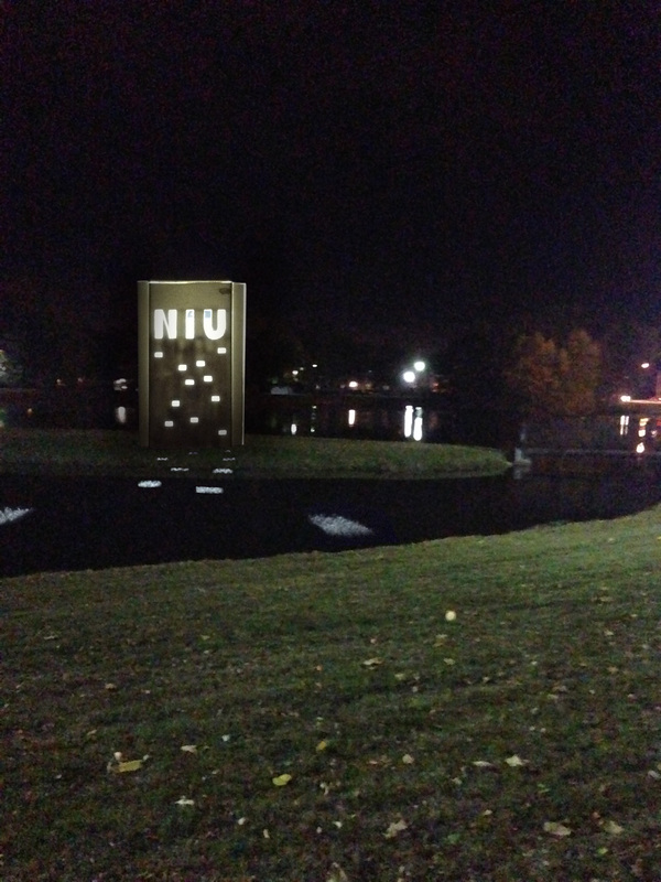
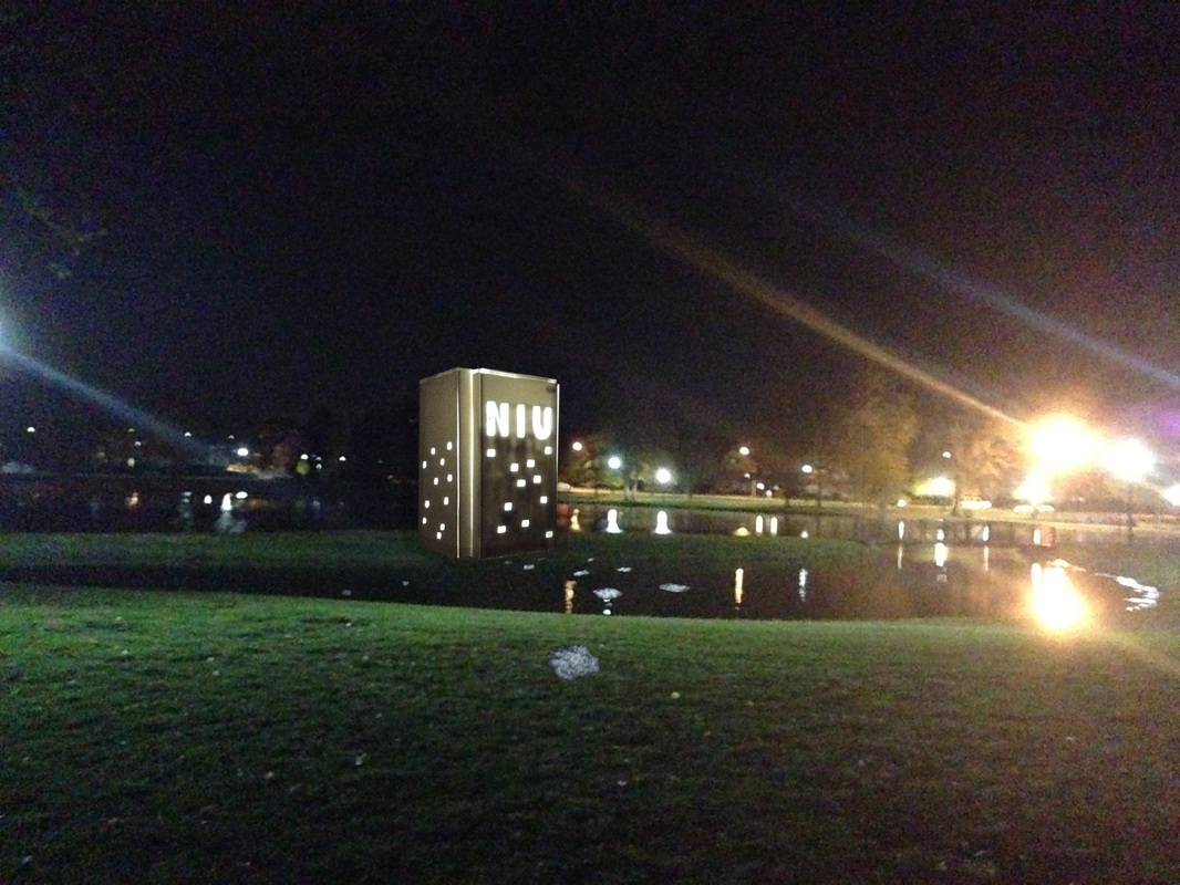
Okay, first thing I want to say is that I absolutely HATE foam core, it is some of the most unforgiving material I have ever worked with and if I can avoid it, I will. So now that that’s out of the way the project that we were assigned to do was to make a scale model of a statue that is to be placed on campus and I didn’t have too many ideas on where to go with this, but while I was walking home I looked up and there in front of me is the tallest building in DeKalb, the student center/hotel, and I thought what more iconic to NIU than that building, you can see it from just about anywhere on campus. Next came the conceptual idea for the piece, I wanted it to reach out and catch people’s eyes, like the student center does, even at night. So I have a light source inside the piece that when its night time would cast the light far out to draw people in. light is a great thing to use conceptually, it guides you through the dark, like how NIU guides all its student to their futures. NIU is the largest cut out on the piece to really drive home that point. The rectangle idea came from one of my other classes about a method of design called Swiss design where everything lines up with each other and moves the viewer’s eye throughout the piece. I had no idea if this translated to 3d work and would look good and with out the computers help things aren’t that perfect but I feel that compositionally it works well for the piece. I did not really enjoy this project mainly because of the material and lack of ideas I came up with during the process, it felt like I didn’t give a hundred percent this time, and I'm not entirely happy with the way it came out, it looks decent when lit up and the lights are off.
Design from Line, Assignment 2
|
|
|
|
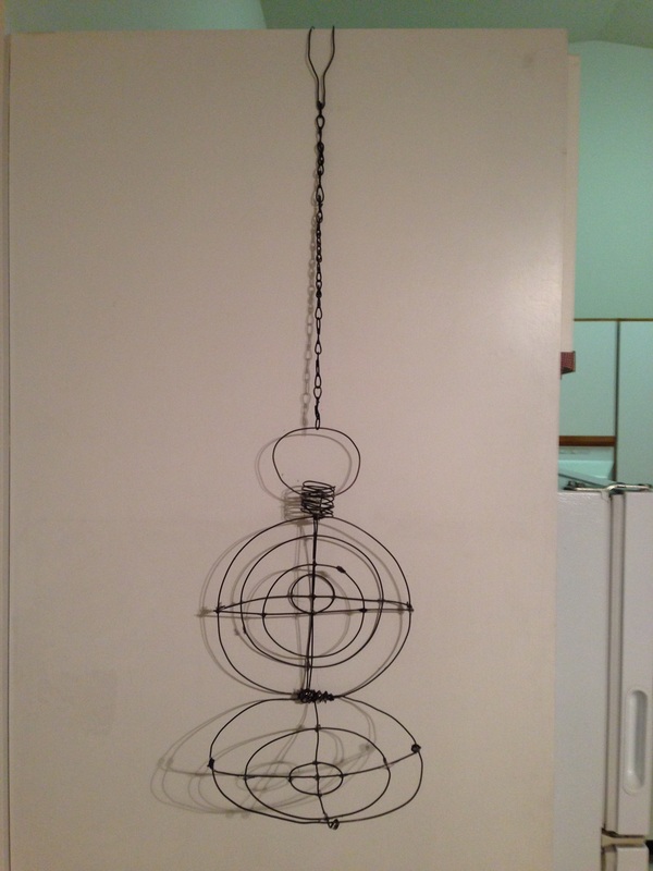
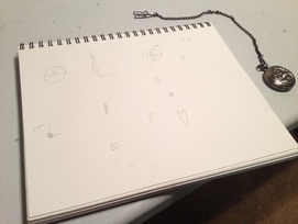
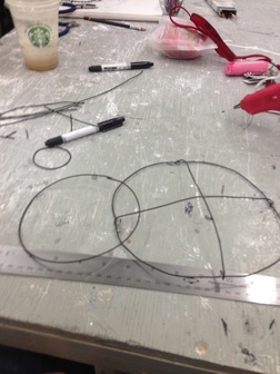
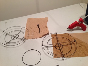
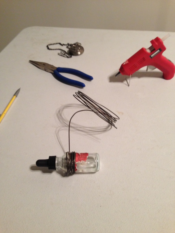
The line assignment is definitely looking at things in a different way, so my idea was to make my piece that incorporated its own way of displaying it self. The pocket watch is a symbol on its own, the chain can be interpreted as an attempt to keep hold of time, as if there is a moment we wish was still here. So the pocket watch is powerful on its own, and when stripped down to the bare minimum, it becomes something else. We see it for what it truly is, a mere object that only gives us the realization that everything passes and there is no true way to stop time. What has happened can’t be undone, and even though we hold the time in our hands we cant change it. The piece is meant to be suspended so that the viewer has to look up at it. A pocket watch is meant to be worn and kept on hand, with the piece out of reach it furthers the idea that we can’t control time, because its out of our reach. The hard part of this assignment was coming up with the idea on how to balance the piece, and making the chain to hold it up without making it off balance. Creating the ninety degree angle without support underneath it was a challenge. Overall I liked this assignment, it makes you look at things from a different point of view. It’s the first time I have ever made something that was supposed to be suspended and incorporated the way it was suspended into the design, and a lot of the ideas for the conceptual aspect of the piece came to me as I was making it. That’s normally how I go about creating art, I let the piece tell me what it is.
Object Interaction, Assignment 1
|
|
|
|
|
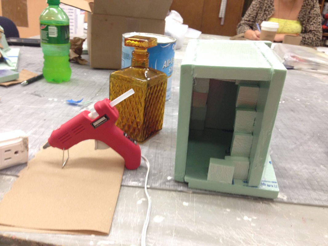
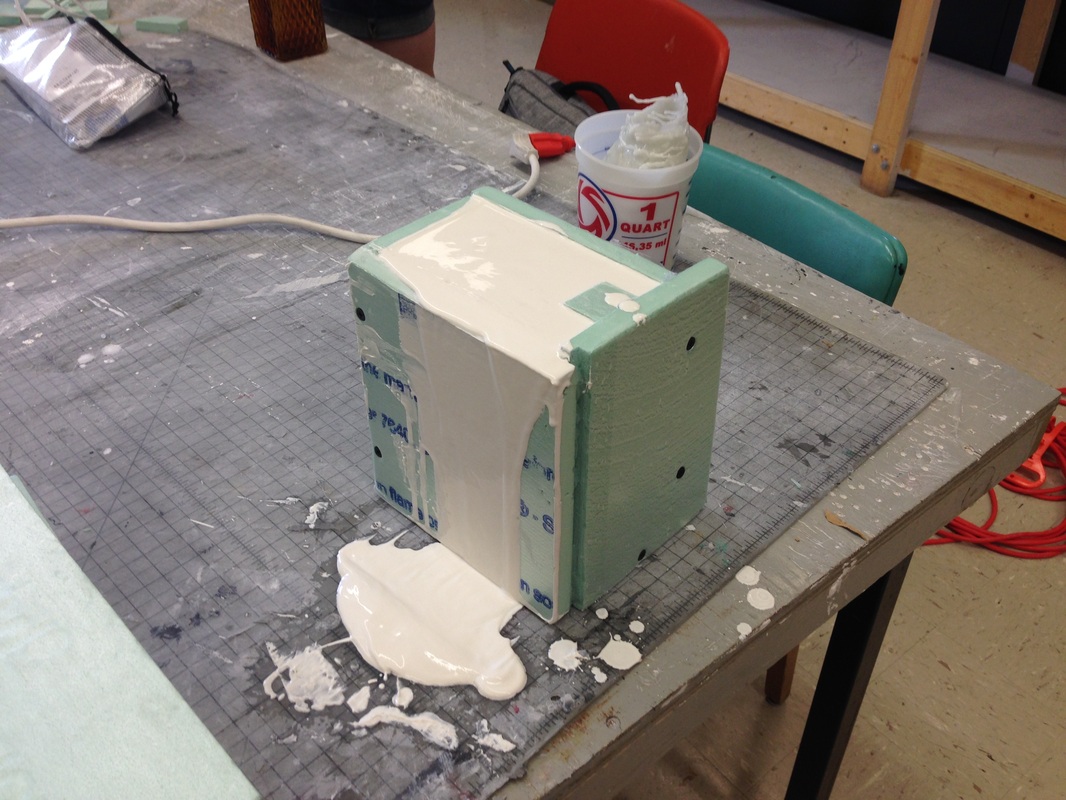
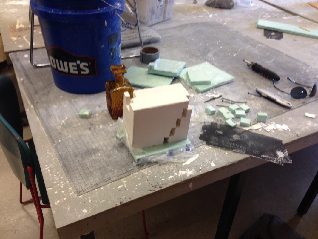
When I first started thinking about what I wanted to do for this project, I had some how gotten it into my head that I was to be molding the object we were supposed to bring in. The first day though, I quickly found out that was not correct and needed to come up with something else and quick. Since this was my first three-dimensional artwork I really wanted to make something that needed to be seen from all sides. My old ideas were about the sense that the bottle was pouring a liquid and having the viewer follow it all the way around till they were in the same spot but looking somewhere else. Working with plaster felt like I had to start from the end and work my way back. Normally I would have to start blank and make something from nothing. So not wanting to overwhelm myself I decided that with the geometric feel of the bottle, it would be good to keep that style throughout the piece, that’s where I got the idea for stairs. When I was messing around with the bottle and trying to figure out how to place it on piece, I found it could hold itself up diagonally with the cap being used as a stand. Overall I am pleased with the result, it is engaging and when I look at it I cant help but try and see every side of it. I believe I achieved what I wanted from this project. One thing that I am not to pleased with is the lack of time I had with the piece, I wanted to really make it smooth and sand down some areas, but I just wasn’t able to find the time. I see now that I need to really get going when it come to sculpting and make the time to ensure I get what I want out of my work. This has been a very new and rewarding experience working with plaster and thinking not only about what is in front of me, but also what is beyond what I see, and how it all relates to one another.
